Making Use of Payara Server's Monitoring Service - Part 3: Using Kibana to Visualise the Data
Originally published on 25 Aug 2016
Last updated on 25 Aug 2016
 by Fraser Savage
When Payara Server has been logging monitoring data to the server log for a short while, the metrics that Logstash outputs to Elasticsearch can be visualised using Kibana. In this blog post, we will create a date histogram displaying used heap memory as a percentage of the maximum heap memory.
Setting up Kibana
Getting Kibana running is again a case of downloading the zip/tar archive from elastic.co and extracting it to the desired working directory. At the time of writing Kibana 4.5.4 is the available stable release. Once extracted the directory should look similar to this:

To start the Kibana server we run the following:
> ./bin/kibana
Kibana then should detect the running Elasticsearch instance as part of the start up process, with log output looking something like:

With that done successfully, Kibana is ready to start tinkering with!
Viewing the data from Elasticsearch in Kibana
Before Kibana can use the data in Elasticsearch it needs an index pattern to be configured. Loading localhost:5601 in a browser should load the 'Configure an index pattern' dialogue if there are no patterns configured. Change the time-field name to @timestamp so the configuration should look like this:
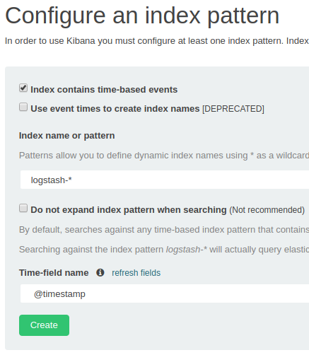
Note: If the dialogue isn't loaded then you can configure index patterns by clicking Settings, then Indices.
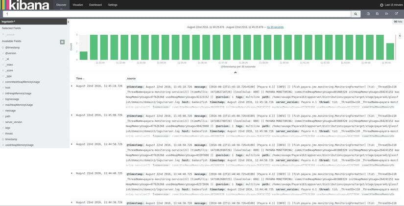
With the index pattern created, clicking on the tab labelled Discover should show the processed log entries from the monitoring service corresponding to the time filter being used:
(click images to enlarge)
The Discover tab can be used to explore indices, view select fields, and filter out events with a timestamp not within a specified period (or periods). By default, it will show data from all indices (using the wildcard *) and display the _source field. Fields can be selected along the left, while time filtering can be done by clicking on the clock icon in the top right corner of the page and using the dialogue shown.
Creating a JVM heap memory usage visualisation
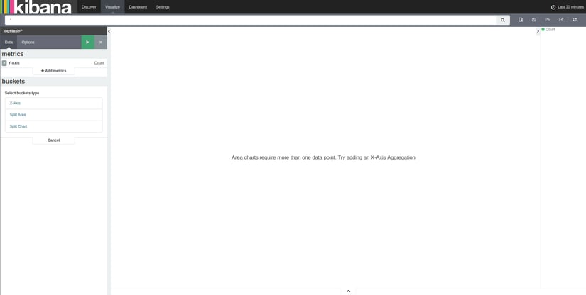
With data available to Kibana some visualisations can be created and then added to the Dashboard tab. Clicking on the Visualize tab will load a 'Create new visualization' dialogue, containing a list of the categories of visualisation available. Select Area Chart so a stacked timeline can be created. Following that, the dialogue for step 2 will be shown, where the search source of the visualisation is selected. Selecting From a new search will load the newly created visualisation, ready to edit. The blank visualisation edit screen will look like this:
To get an area chart visualisation to show, Kibana must be provided with an X axis aggregation. Selecting the X-Axis option in the 'buckets' dialogue will provide a list of different aggregations available. Set it to 'Date Histogram' and change the field to be used to @timestamp. The result can be previewed by hitting the green 'Play' button, although it won't show a useful result yet.
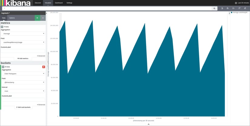
Next the Y-Axis metrics must be set up. To set up the first metric, expand the existing metric by clicking on the button to the left of it which should make the available aggregations visible. The default aggregation, Count, is the event count for each bucket. Changing this aggregation to Average will allow for the selection of fields. Here, set the field to usedHeapMemoryUsage to and reload the visualisation. With the JBatch Schedule and Simple EJB Timer example applications deployed, monitoring data might cause the visualisation to look similar to the image below.
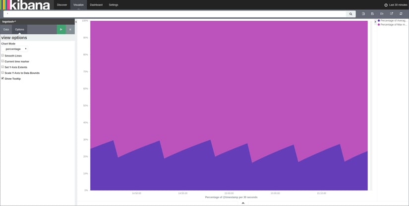
Adding a second Y-Axis metric is done by clicking Add metrics and then selecting Y-Axis. This time, use Max as the aggregation and set the field to maxHeapMemoryUsage. This stacks the metric on top of the other one directly, however, this type of stacking isn't as useful for these two metrics in particular. To change the chart to something a little more useful, click on the Options tab and switch the chart mode from stacked to percentage. Performing these steps results in a change similar to that shown below:
Save the visualisation by using the save item in the top right corner, so that it can then can be used in the Kibana dashboard.
Adding the visualisation to the dashboard
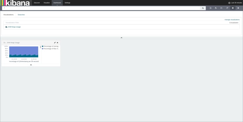
To get to the Kibana dashboard click the Dashboard tab next to the Visualize tab. To begin with, the loaded dashboard should be empty. To add the visualisation just created to the dashboard, click the + button in the top right of the menu bar and then select it from the list of visualisations. If the created visualisation does not show up, make sure that the filter is blank. Selecting the visualisation should add it to the dashboard:
Related Posts
What’s New in the October 2024 Payara Platform Release?
Published on 09 Oct 2024
by Luqman Saeed
0 Comments
We're happy to announce the latest release of the Payara Platform, bringing significant improvements and updates across our Community and Enterprise editions (download Payara Enterprise trial here). This release focuses on enhancing security, ...
Continuous Integration and Continuous Deployment for Jakarta EE Applications Made Easy
Published on 25 Mar 2024
by Luqman Saeed
1 Comment


